Advanced Model Insights
This notebook explores additional options for model insights added in the v2.7 release of the DataRobot API.
Prerequisites
In order to run this notebook yourself, you will need the following:
- This notebook. If you are viewing this in the HTML documentation bundle, you can download all of the example notebooks and supporting materials from Downloads.
- The dataset required for this notebook. This is in the same directory as this notebook.
- A DataRobot API token. You can find your API token by logging into the DataRobot Web User Interface and looking in your
Profile.
Preparation
This notebook explores additional options for model insights added in the v2.7 release of the DataRobot API.
Let’s start with importing some packages that will help us with presentation (if you don’t have them installed already, you’ll have to install them to run this notebook).
[1]:
%matplotlib inline
import matplotlib.pyplot as plt
import matplotlib.ticker as mtick
import pandas as pd
import datarobot as dr
import numpy as np
from datarobot.enums import AUTOPILOT_MODE
from datarobot.errors import ClientError
Configure the Python Client
Configuring the client requires the following two things:
- A DataRobot endpoint - where the API server can be found
- A DataRobot API token - a token the server uses to identify and validate the user making API requests
The endpoint is usually the URL you would use to log into the DataRobot Web User Interface (e.g., https://app.datarobot.com) with “/api/v2/” appended, e.g., (https://app.datarobot.com/api/v2/).
You can find your API token by logging into the DataRobot Web User Interface and looking in your Profile.
The Python client can be configured in several ways. The example we’ll use in this notebook is to point to a yaml file that has the information. This is a text file containing two lines like this:
endpoint: https://app.datarobot.com/api/v2/
token: not-my-real-token
If you want to run this notebook without changes, please save your configuration in a file located under your home directory called ~/.config/datarobot/drconfig.yaml.
[2]:
# Initialization with arguments
# dr.Client(token='<API TOKEN>', endpoint='https://<YOUR ENDPOINT>/api/v2/')

# Initialization with a config file in the same directory as this notebook
# dr.Client(config_path='drconfig.yaml')

# Initialization with a config file located at
# ~/.config/datarobot/dr.config.yaml
dr.Client()
[2]:
<datarobot.rest.RESTClientObject at 0x1119c0d90>
Create Project with features
Create a new project using the 10K_diabetes dataset. This dataset contains a binary classification on the target readmitted. This project is an excellent example of the advanced model insights available from DataRobot models.
[3]:
url = 'https://s3.amazonaws.com/datarobot_public_datasets/10k_diabetes.xlsx'
project = dr.Project.create(url, project_name='10K Advanced Modeling')
print('Project ID: {}'.format(project.id))
Project ID: 5c0008e06523cd0233c49fe4
[4]:
# Increase the worker count to your maximum available the project runs faster.
project.set_worker_count(-1)
[4]:
Project(10K Advanced Modeling)
[5]:
target_feature_name = 'readmitted'
project.set_target(target_feature_name, mode=AUTOPILOT_MODE.QUICK)
[5]:
Project(10K Advanced Modeling)
[6]:
project.wait_for_autopilot()
In progress: 14, queued: 0 (waited: 0s)
In progress: 14, queued: 0 (waited: 1s)
In progress: 14, queued: 0 (waited: 1s)
In progress: 14, queued: 0 (waited: 2s)
In progress: 14, queued: 0 (waited: 3s)
In progress: 14, queued: 0 (waited: 5s)
In progress: 11, queued: 0 (waited: 9s)
In progress: 10, queued: 0 (waited: 16s)
In progress: 6, queued: 0 (waited: 29s)
In progress: 1, queued: 0 (waited: 49s)
In progress: 7, queued: 0 (waited: 70s)
In progress: 1, queued: 0 (waited: 90s)
In progress: 16, queued: 0 (waited: 111s)
In progress: 10, queued: 0 (waited: 131s)
In progress: 6, queued: 0 (waited: 151s)
In progress: 2, queued: 0 (waited: 172s)
In progress: 0, queued: 0 (waited: 192s)
In progress: 5, queued: 0 (waited: 213s)
In progress: 1, queued: 0 (waited: 233s)
In progress: 4, queued: 0 (waited: 253s)
In progress: 1, queued: 0 (waited: 274s)
In progress: 1, queued: 0 (waited: 294s)
In progress: 0, queued: 0 (waited: 315s)
In progress: 0, queued: 0 (waited: 335s)
[7]:
models = project.get_models()
model = models[0]
model
[7]:
Model(u'AVG Blender')
Let’s set some color constants to replicate visual style of DataRobot lift chart.
[8]:
dr_dark_blue = '#08233F'
dr_blue = '#1F77B4'
dr_orange = '#FF7F0E'
dr_red = '#BE3C28'
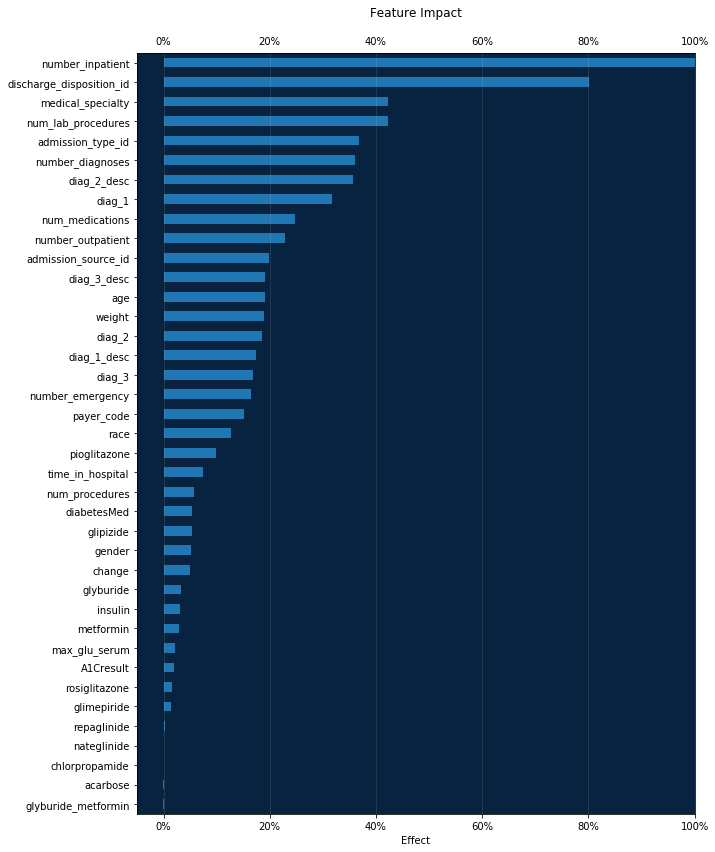
Feature Impact
Feature Impact is available for all model types and works by altering input data and observing the effect on a model’s score. It is an on-demand feature, meaning that you must initiate a calculation to see the results. Once you have had DataRobot compute the feature impact for a model, that information is saved with the project.
Feature Impact measures how important a feature is in the context of a model. That is, it measures how much the accuracy of a model would decrease if that feature were removed.
[9]:
feature_impacts = model.get_or_request_feature_impact()
[10]:
# Formats the ticks from a float into a percent
percent_tick_fmt = mtick.PercentFormatter(xmax=1.0)

impact_df = pd.DataFrame(feature_impacts)
impact_df.sort_values(by='impactNormalized', ascending=True, inplace=True)

# Positive values are blue, negative are red
bar_colors = impact_df.impactNormalized.apply(lambda x: dr_red if x < 0
                                              else dr_blue)

ax = impact_df.plot.barh(x='featureName', y='impactNormalized',
                         legend=False,
                         color=bar_colors,
                         figsize=(10, 14))
ax.xaxis.set_major_formatter(percent_tick_fmt)
ax.xaxis.set_tick_params(labeltop=True)
ax.xaxis.grid(True, alpha=0.2)
ax.set_facecolor(dr_dark_blue)

plt.ylabel('')
plt.xlabel('Effect')
plt.xlim((None, 1))  # Allow for negative impact
plt.title('Feature Impact', y=1.04)
[10]:
Text(0.5,1.04,'Feature Impact')
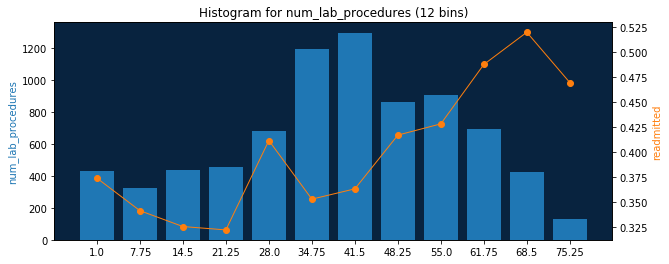
Feature Histogram
Feature histogram is a popular EDA tool for visualizing features. Using DataRobot feature histogram API it is easy to draw them.
For starters, let us set up two convenient functions.
First helper function below - matplotlib_pair_histogram - will be used to draw histograms paired with project target feature. We also attach an orange mark to every histogram bin with average target feature value for rows in that bin.
[11]:
def matplotlib_pair_histogram(labels, counts, target_avgs,
                              bin_count, ax1, feature):
    # Rotate categorical labels
    if feature.feature_type in ['Categorical', 'Text']:
        ax1.tick_params(axis='x', rotation=45)
    ax1.set_ylabel(feature.name, color=dr_blue)
    ax1.bar(labels, counts, color=dr_blue)
    # Instantiate a second axes that shares the same x-axis
    ax2 = ax1.twinx()
    ax2.set_ylabel(target_feature_name, color=dr_orange)
    ax2.plot(labels, target_avgs, marker='o', lw=1, color=dr_orange)
    ax1.set_facecolor(dr_dark_blue)
    title = 'Histogram for {} ({} bins)'.format(feature.name, bin_count)
    ax1.set_title(title)
Let us also create high level function draw_feature_histogram, which will get histogram data and draw histogram using helper function we have just created. But first let try to retrieve downsampled histogram data and have a look at it:
[12]:
feature = dr.Feature.get(project.id, 'num_lab_procedures')
feature.get_histogram(bin_limit=6).plot
[12]:
[{'count': 755, 'label': u'1.0', 'target': 0.36026490066225164},
 {'count': 895, 'label': u'14.5', 'target': 0.3240223463687151},
 {'count': 1875, 'label': u'28.0', 'target': 0.3744},
 {'count': 2159, 'label': u'41.5', 'target': 0.38490041685965726},
 {'count': 1603, 'label': u'55.0', 'target': 0.45414847161572053},
 {'count': 557, 'label': u'68.5', 'target': 0.5080789946140036}]
For best accuracy it is recommended to use divisors of 60 for bin_limit, but actully any values <= 60 can be used as well.
target values are basically project target input average values for that bins. Please refer to FeatureHistogram for documentation details.
So, our high level function draw_feature_histogram will be like:
[14]:
def draw_feature_histogram(feature_name, bin_count):
    feature = dr.Feature.get(project.id, feature_name)
    # Retrieve downsampled histogram data from server
    # based on desired bin count
    data = feature.get_histogram(bin_count).plot
    labels = [row['label'] for row in data]
    counts = [row['count'] for row in data]
    target_averages = [row['target'] for row in data]
    f, axarr = plt.subplots()
    f.set_size_inches((10, 4))
    matplotlib_pair_histogram(labels, counts, target_averages,
                              bin_count, axarr, feature)
Done! Now we can just specify feature name and desired bin count to get feature histograms. Example for numerical feature:
[15]:
draw_feature_histogram('num_lab_procedures', 12)
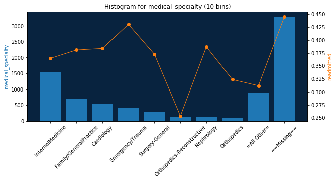
Categorical and other feature types are supported as well:
[16]:
draw_feature_histogram('medical_specialty', 10)
Lift Chart
A lift chart will show you how close in general model predictions are to the actual target values in the training data.
The lift chart data we retrieve from the server includes the average model prediction and the average actual target values, sorted by the prediction values in ascending order and split into up to 60 bins.
bin_weight parameter shows how much weight is in each bin (number of rows for unweighted projects).
[17]:
lc = model.get_lift_chart('validation')
lc
[17]:
LiftChart(validation)
[18]:
bins_df = pd.DataFrame(lc.bins)
bins_df.head()
[18]:
| actual | bin_weight | predicted | |
|---|---|---|---|
| 0 | 0.037037 | 27.0 | 0.097886 |
| 1 | 0.037037 | 27.0 | 0.137739 |
| 2 | 0.076923 | 26.0 | 0.162243 |
| 3 | 0.185185 | 27.0 | 0.173459 |
| 4 | 0.333333 | 27.0 | 0.188488 |
Let’s define our rebinning and plotting functions.
[19]:
def rebin_df(raw_df, number_of_bins):
    cols = ['bin', 'actual_mean', 'predicted_mean', 'bin_weight']
    new_df = pd.DataFrame(columns=cols)
    current_prediction_total = 0
    current_actual_total = 0
    current_row_total = 0
    x_index = 1
    bin_size = 60 / number_of_bins
    for rowId, data in raw_df.iterrows():
        current_prediction_total += data['predicted'] * data['bin_weight']
        current_actual_total += data['actual'] * data['bin_weight']
        current_row_total += data['bin_weight']

        if ((rowId + 1) % bin_size == 0):
            x_index += 1
            bin_properties = {
                'bin': ((round(rowId + 1) / 60) * number_of_bins),
                'actual_mean': current_actual_total / current_row_total,
                'predicted_mean': current_prediction_total / current_row_total,
                'bin_weight': current_row_total
            }

            new_df = new_df.append(bin_properties, ignore_index=True)
            current_prediction_total = 0
            current_actual_total = 0
            current_row_total = 0
    return new_df


def matplotlib_lift(bins_df, bin_count, ax):
    grouped = rebin_df(bins_df, bin_count)
    ax.plot(range(1, len(grouped) + 1), grouped['predicted_mean'],
            marker='+', lw=1, color=dr_blue)
    ax.plot(range(1, len(grouped) + 1), grouped['actual_mean'],
            marker='*', lw=1, color=dr_orange)
    ax.set_xlim([0, len(grouped) + 1])
    ax.set_facecolor(dr_dark_blue)
    ax.legend(loc='best')
    ax.set_title('Lift chart {} bins'.format(bin_count))
    ax.set_xlabel('Sorted Prediction')
    ax.set_ylabel('Value')
    return grouped
Now we can show all lift charts we propose in DataRobot web application.
Note 1 : While this method will work for any bin count less then 60 - the most reliable result will be achieved when the number of bins is a divisor of 60.
Note 2 : This visualization method will NOT work for bin count > 60 because DataRobot does not provide enough information for a larger resolution.
[20]:
bin_counts = [10, 12, 15, 20, 30, 60]
f, axarr = plt.subplots(len(bin_counts))
f.set_size_inches((8, 4 * len(bin_counts)))

rebinned_dfs = []
for i in range(len(bin_counts)):
    rebinned_dfs.append(matplotlib_lift(bins_df, bin_counts[i], axarr[i]))
plt.tight_layout()
Rebinned Data
You may want to interact with the raw re-binned data for use in third party tools, or for additional evaluation.
[21]:
for rebinned in rebinned_dfs:
    print('Number of bins: {}'.format(len(rebinned.index)))
    print(rebinned)
Number of bins: 10
    bin  actual_mean  predicted_mean  bin_weight
0   1.0      0.13750        0.159916       160.0
1   2.0      0.17500        0.233332       160.0
2   3.0      0.27500        0.276564       160.0
3   4.0      0.28750        0.317841       160.0
4   5.0      0.41250        0.355449       160.0
5   6.0      0.33750        0.394435       160.0
6   7.0      0.49375        0.436481       160.0
7   8.0      0.54375        0.490176       160.0
8   9.0      0.62500        0.559797       160.0
9  10.0      0.68125        0.697142       160.0
Number of bins: 12
     bin  actual_mean  predicted_mean  bin_weight
0    1.0     0.134328        0.151886       134.0
1    2.0     0.180451        0.220872       133.0
2    3.0     0.210526        0.259316       133.0
3    4.0     0.313433        0.294237       134.0
4    5.0     0.293233        0.327699       133.0
5    6.0     0.413534        0.358398       133.0
6    7.0     0.353383        0.390993       133.0
7    8.0     0.440299        0.425269       134.0
8    9.0     0.556391        0.465567       133.0
9   10.0     0.556391        0.515761       133.0
10  11.0     0.609023        0.583067       133.0
11  12.0     0.701493        0.712181       134.0
Number of bins: 15
     bin  actual_mean  predicted_mean  bin_weight
0    1.0     0.084112        0.142650       107.0
1    2.0     0.177570        0.206029       107.0
2    3.0     0.207547        0.241613       106.0
3    4.0     0.271028        0.269917       107.0
4    5.0     0.308411        0.297614       107.0
5    6.0     0.264151        0.324330       106.0
6    7.0     0.420561        0.349149       107.0
7    8.0     0.367925        0.374717       106.0
8    9.0     0.336449        0.400959       107.0
9   10.0     0.485981        0.428771       107.0
10  11.0     0.518868        0.460771       106.0
11  12.0     0.551402        0.500419       107.0
12  13.0     0.603774        0.543591       106.0
13  14.0     0.635514        0.610431       107.0
14  15.0     0.719626        0.730594       107.0
Number of bins: 20
     bin  actual_mean  predicted_mean  bin_weight
0    1.0       0.0500        0.132253        80.0
1    2.0       0.2250        0.187579        80.0
2    3.0       0.1750        0.221244        80.0
3    4.0       0.1750        0.245419        80.0
4    5.0       0.2500        0.266226        80.0
5    6.0       0.3000        0.286902        80.0
6    7.0       0.3375        0.308215        80.0
7    8.0       0.2375        0.327466        80.0
8    9.0       0.4250        0.346325        80.0
9   10.0       0.4000        0.364573        80.0
10  11.0       0.3625        0.384512        80.0
11  12.0       0.3125        0.404358        80.0
12  13.0       0.4875        0.425218        80.0
13  14.0       0.5000        0.447743        80.0
14  15.0       0.5875        0.474525        80.0
15  16.0       0.5000        0.505826        80.0
16  17.0       0.6250        0.536862        80.0
17  18.0       0.6250        0.582731        80.0
18  19.0       0.6250        0.640753        80.0
19  20.0       0.7375        0.753532        80.0
Number of bins: 30
     bin  actual_mean  predicted_mean  bin_weight
0    1.0     0.037037        0.117812        54.0
1    2.0     0.132075        0.167957        53.0
2    3.0     0.245283        0.194772        53.0
3    4.0     0.111111        0.217077        54.0
4    5.0     0.264151        0.234340        53.0
5    6.0     0.150943        0.248885        53.0
6    7.0     0.259259        0.262677        54.0
7    8.0     0.283019        0.277293        53.0
8    9.0     0.283019        0.289984        53.0
9   10.0     0.333333        0.305103        54.0
10  11.0     0.226415        0.317688        53.0
11  12.0     0.301887        0.330972        53.0
12  13.0     0.415094        0.343545        53.0
13  14.0     0.425926        0.354649        54.0
14  15.0     0.396226        0.368169        53.0
15  16.0     0.339623        0.381265        53.0
16  17.0     0.314815        0.394318        54.0
17  18.0     0.358491        0.407725        53.0
18  19.0     0.452830        0.422268        53.0
19  20.0     0.518519        0.435153        54.0
20  21.0     0.509434        0.452046        53.0
21  22.0     0.528302        0.469495        53.0
22  23.0     0.641509        0.489711        53.0
23  24.0     0.462963        0.510929        54.0
24  25.0     0.641509        0.530756        53.0
25  26.0     0.566038        0.556426        53.0
26  27.0     0.666667        0.591609        54.0
27  28.0     0.603774        0.629608        53.0
28  29.0     0.698113        0.676879        53.0
29  30.0     0.740741        0.783314        54.0
Number of bins: 60
     bin  actual_mean  predicted_mean  bin_weight
0    1.0     0.037037        0.097886        27.0
1    2.0     0.037037        0.137739        27.0
2    3.0     0.076923        0.162243        26.0
3    4.0     0.185185        0.173459        27.0
4    5.0     0.333333        0.188488        27.0
5    6.0     0.153846        0.201298        26.0
6    7.0     0.148148        0.213213        27.0
7    8.0     0.074074        0.220940        27.0
8    9.0     0.307692        0.229899        26.0
9   10.0     0.222222        0.238617        27.0
10  11.0     0.111111        0.245402        27.0
11  12.0     0.192308        0.252501        26.0
12  13.0     0.259259        0.258865        27.0
13  14.0     0.259259        0.266489        27.0
14  15.0     0.230769        0.273597        26.0
15  16.0     0.333333        0.280852        27.0
16  17.0     0.333333        0.286678        27.0
17  18.0     0.230769        0.293418        26.0
18  19.0     0.259259        0.301547        27.0
19  20.0     0.407407        0.308660        27.0
20  21.0     0.346154        0.314679        26.0
21  22.0     0.111111        0.320585        27.0
22  23.0     0.307692        0.327277        26.0
23  24.0     0.296296        0.334530        27.0
24  25.0     0.407407        0.340926        27.0
25  26.0     0.423077        0.346264        26.0
26  27.0     0.444444        0.351782        27.0
27  28.0     0.407407        0.357515        27.0
28  29.0     0.461538        0.364479        26.0
29  30.0     0.333333        0.371723        27.0
30  31.0     0.407407        0.378530        27.0
31  32.0     0.269231        0.384105        26.0
32  33.0     0.407407        0.390886        27.0
33  34.0     0.222222        0.397751        27.0
34  35.0     0.461538        0.403918        26.0
35  36.0     0.259259        0.411391        27.0
36  37.0     0.481481        0.419135        27.0
37  38.0     0.423077        0.425521        26.0
38  39.0     0.555556        0.431010        27.0
39  40.0     0.481481        0.439296        27.0
40  41.0     0.538462        0.448068        26.0
41  42.0     0.481481        0.455876        27.0
42  43.0     0.576923        0.464854        26.0
43  44.0     0.481481        0.473965        27.0
44  45.0     0.703704        0.484397        27.0
45  46.0     0.576923        0.495230        26.0
46  47.0     0.444444        0.505163        27.0
47  48.0     0.481481        0.516694        27.0
48  49.0     0.615385        0.526190        26.0
49  50.0     0.666667        0.535152        27.0
50  51.0     0.592593        0.548849        27.0
51  52.0     0.538462        0.564293        26.0
52  53.0     0.555556        0.581138        27.0
53  54.0     0.777778        0.602079        27.0
54  55.0     0.576923        0.619633        26.0
55  56.0     0.629630        0.639213        27.0
56  57.0     0.666667        0.662629        27.0
57  58.0     0.730769        0.691678        26.0
58  59.0     0.666667        0.740971        27.0
59  60.0     0.814815        0.825658        27.0
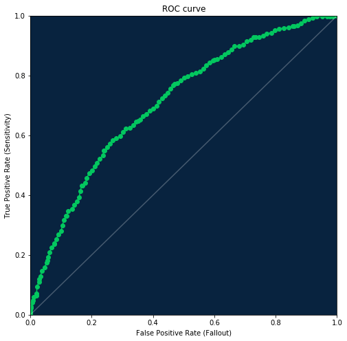
ROC curve
The receiver operating characteristic curve, or ROC curve, is a graphical plot that illustrates the performance of a binary classifier system as its discrimination threshold is varied. The curve is created by plotting the true positive rate (TPR) against the false positive rate (FPR) at various threshold settings.
To retrieve ROC curve information use the Model.get_roc_curve method.
[22]:
roc = model.get_roc_curve('validation')
roc
[22]:
RocCurve(validation)
[23]:
df = pd.DataFrame(roc.roc_points)
df.head()
[23]:
| accuracy | f1_score | false_negative_score | false_positive_rate | false_positive_score | matthews_correlation_coefficient | negative_predictive_value | positive_predictive_value | threshold | true_negative_rate | true_negative_score | true_positive_rate | true_positive_score | |
|---|---|---|---|---|---|---|---|---|---|---|---|---|---|
| 0 | 0.603125 | 0.000000 | 635 | 0.000000 | 0 | 0.000000 | 0.603125 | 0.0000 | 1.000000 | 1.000000 | 965 | 0.000000 | 0 |
| 1 | 0.604375 | 0.006279 | 633 | 0.000000 | 0 | 0.043612 | 0.603880 | 1.0000 | 0.919849 | 1.000000 | 965 | 0.003150 | 2 |
| 2 | 0.606875 | 0.018721 | 629 | 0.000000 | 0 | 0.075632 | 0.605395 | 1.0000 | 0.881041 | 1.000000 | 965 | 0.009449 | 6 |
| 3 | 0.609375 | 0.031008 | 625 | 0.000000 | 0 | 0.097764 | 0.606918 | 1.0000 | 0.839455 | 1.000000 | 965 | 0.015748 | 10 |
| 4 | 0.611875 | 0.046083 | 620 | 0.001036 | 1 | 0.111058 | 0.608586 | 0.9375 | 0.798130 | 0.998964 | 964 | 0.023622 | 15 |
Threshold operations
You can get the recommended threshold value with maximal F1 score using RocCurve.get_best_f1_threshold method. That is the same threshold that is preselected in DataRobot when you open “ROC curve” tab.
[24]:
threshold = roc.get_best_f1_threshold()
threshold
[24]:
0.3410205659739286
To estimate metrics for different threshold values just pass it to the RocCurve.estimate_threshold method. This will produce the same results as updating threshold on the DataRobot “ROC curve” tab.
[25]:
metrics = roc.estimate_threshold(threshold)
metrics
[25]:
{'accuracy': 0.62625,
 'f1_score': 0.6215189873417721,
 'false_negative_score': 144,
 'false_positive_rate': 0.47046632124352333,
 'false_positive_score': 454,
 'matthews_correlation_coefficient': 0.30124189206636187,
 'negative_predictive_value': 0.7801526717557252,
 'positive_predictive_value': 0.5195767195767196,
 'threshold': 0.3410205659739286,
 'true_negative_rate': 0.5295336787564767,
 'true_negative_score': 511,
 'true_positive_rate': 0.7732283464566929,
 'true_positive_score': 491}
Confusion matrix
Using a few keys from the retrieved metrics we now can build a confusion matrix for the selected threshold.
[26]:
roc_df = pd.DataFrame({
    'Predicted Negative': [metrics['true_negative_score'],
                           metrics['false_negative_score'],
                           metrics['true_negative_score'] + metrics[
                               'false_negative_score']],
    'Predicted Positive': [metrics['false_positive_score'],
                           metrics['true_positive_score'],
                           metrics['true_positive_score'] + metrics[
                               'false_positive_score']],
    'Total': [len(roc.negative_class_predictions),
              len(roc.positive_class_predictions),
              len(roc.negative_class_predictions) + len(
                  roc.positive_class_predictions)]})
roc_df.index = pd.MultiIndex.from_tuples([
    ('Actual', '-'), ('Actual', '+'), ('Total', '')])
roc_df.columns = pd.MultiIndex.from_tuples([
    ('Predicted', '-'), ('Predicted', '+'), ('Total', '')])
roc_df.style.set_properties(**{'text-align': 'right'})
roc_df
[26]:
| Predicted | Total | |||
|---|---|---|---|---|
| - | + | |||
| Actual | - | 511 | 454 | 962 |
| + | 144 | 491 | 638 | |
| Total | 655 | 945 | 1600 | |
ROC curve plot
[27]:
dr_roc_green = '#03c75f'
white = '#ffffff'
dr_purple = '#65147D'
dr_dense_green = '#018f4f'

fig = plt.figure(figsize=(8, 8))
axes = fig.add_subplot(1, 1, 1, facecolor=dr_dark_blue)

plt.scatter(df.false_positive_rate, df.true_positive_rate, color=dr_roc_green)
plt.plot(df.false_positive_rate, df.true_positive_rate, color=dr_roc_green)
plt.plot([0, 1], [0, 1], color=white, alpha=0.25)
plt.title('ROC curve')
plt.xlabel('False Positive Rate (Fallout)')
plt.xlim([0, 1])
plt.ylabel('True Positive Rate (Sensitivity)')
plt.ylim([0, 1])
[27]:
(0, 1)
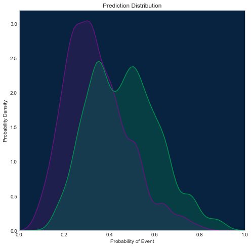
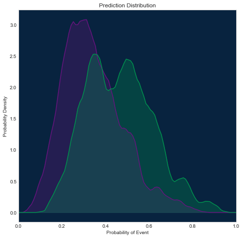
Prediction distribution plot
There are a few different methods for visualizing it, which one to use depends on what packages you have installed. Below you will find 3 different examples.
Using seaborn
[28]:
import seaborn as sns
sns.set_style("whitegrid", {'axes.grid': False})

fig = plt.figure(figsize=(8, 8))
axes = fig.add_subplot(1, 1, 1, facecolor=dr_dark_blue)

shared_params = {'shade': True, 'clip': (0, 1), 'bw': 0.2}
sns.kdeplot(np.array(roc.negative_class_predictions),
            color=dr_purple, **shared_params)
sns.kdeplot(np.array(roc.positive_class_predictions),
            color=dr_dense_green, **shared_params)

plt.title('Prediction Distribution')
plt.xlabel('Probability of Event')
plt.xlim([0, 1])
plt.ylabel('Probability Density')
[28]:
Text(0,0.5,'Probability Density')
Using SciPy
[29]:
from scipy.stats import gaussian_kde

fig = plt.figure(figsize=(8, 8))
axes = fig.add_subplot(1, 1, 1, facecolor=dr_dark_blue)
xs = np.linspace(0, 1, 100)

density_neg = gaussian_kde(roc.negative_class_predictions, bw_method=0.2)
plt.plot(xs, density_neg(xs), color=dr_purple)
plt.fill_between(xs, 0, density_neg(xs), color=dr_purple, alpha=0.3)

density_pos = gaussian_kde(roc.positive_class_predictions, bw_method=0.2)
plt.plot(xs, density_pos(xs), color=dr_dense_green)
plt.fill_between(xs, 0, density_pos(xs), color=dr_dense_green, alpha=0.3)

plt.title('Prediction Distribution')
plt.xlabel('Probability of Event')
plt.xlim([0, 1])
plt.ylabel('Probability Density')
[29]:
Text(0,0.5,'Probability Density')
Using scikit-learn
This way will be most consistent with how we display this plot in DataRobot, because scikit-learn supports additional kernel options, and we can configure the same kernel as we use in web application (epanichkov kernel with size 0.05).
Other examples above use a gaussian kernel, so they may slightly differ from the plot in the DataRobot interface.
[30]:
from sklearn.neighbors import KernelDensity

fig = plt.figure(figsize=(8, 8))
axes = fig.add_subplot(1, 1, 1, facecolor=dr_dark_blue)
xs = np.linspace(0, 1, 100)

X_neg = np.asarray(roc.negative_class_predictions)[:, np.newaxis]
density_neg = KernelDensity(bandwidth=0.05, kernel='epanechnikov').fit(X_neg)
plt.plot(xs, np.exp(density_neg.score_samples(xs[:, np.newaxis])),
         color=dr_purple)
plt.fill_between(xs, 0, np.exp(density_neg.score_samples(xs[:, np.newaxis])),
                 color=dr_purple, alpha=0.3)

X_pos = np.asarray(roc.positive_class_predictions)[:, np.newaxis]
density_pos = KernelDensity(bandwidth=0.05, kernel='epanechnikov').fit(X_pos)
plt.plot(xs, np.exp(density_pos.score_samples(xs[:, np.newaxis])),
         color=dr_dense_green)
plt.fill_between(xs, 0, np.exp(density_pos.score_samples(xs[:, np.newaxis])),
                 color=dr_dense_green, alpha=0.3)

plt.title('Prediction Distribution')
plt.xlabel('Probability of Event')
plt.xlim([0, 1])
plt.ylabel('Probability Density')
[30]:
Text(0,0.5,'Probability Density')
Word Cloud
Word cloud is a type of insight available for some text-processing models for datasets containing text columns. You can get information about how the appearance of each ngram (word or sequence of words) in the text field affects the predicted target value.
This example will show you how to obtain word cloud data and visualize it in similar to DataRobot web application way.
The visualization example here uses colour and wordcloud packages, so if you don’t have them, you will need to install them.
First, we will create a color palette similar to what we use in DataRobot.
[31]:
from colour import Color
import wordcloud
[32]:
colors = [Color('#2458EB')]
colors.extend(list(Color('#2458EB').range_to(Color('#31E7FE'), 81))[1:])
colors.extend(list(Color('#31E7FE').range_to(Color('#8da0a2'), 21))[1:])
colors.extend(list(Color('#a18f8c').range_to(Color('#ffad9e'), 21))[1:])
colors.extend(list(Color('#ffad9e').range_to(Color('#d80909'), 81))[1:])
webcolors = [c.get_web() for c in colors]
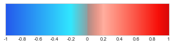
Variable webcolors now contains 201 ([-1, 1] interval with step 0.01) colors that will be used in the word cloud. Let’s look at our palette.
[33]:
from matplotlib.colors import LinearSegmentedColormap
dr_cmap = LinearSegmentedColormap.from_list('DataRobot',
                                            webcolors,
                                            N=len(colors))
x = np.arange(-1, 1.01, 0.01)
y = np.arange(0, 40, 1)
X = np.meshgrid(x, y)[0]
plt.xticks([0, 20, 40, 60, 80, 100, 120, 140, 160, 180, 200],
           ['-1', '-0.8', '-0.6', '-0.4', '-0.2', '0',
            '0.2', '0.4', '0.6', '0.8', '1'])
plt.yticks([], [])
im = plt.imshow(X, interpolation='nearest', origin='lower', cmap=dr_cmap)
Now we will pick some model that provides a word cloud in the DataRobot. Any “Auto-Tuned Word N-Gram Text Modeler” should work.
[34]:
models = project.get_models()
[35]:
model_with_word_cloud = None
for model in models:
    try:
        model.get_word_cloud()
        model_with_word_cloud = model
        break
    except ClientError as e:
        if e.json['message'] and 'No word cloud data' in e.json['message']:
            pass
        else:
            raise

model_with_word_cloud
[35]:
Model(u'Auto-Tuned Word N-Gram Text Modeler using token occurrences - diag_1_desc')
[36]:
wc = model_with_word_cloud.get_word_cloud(exclude_stop_words=True)
[37]:
def word_cloud_plot(wc, font_path=None):
    # Stopwords usually dominate any word cloud, so we will filter them out
    dict_freq = {wc_word['ngram']: wc_word['frequency']
                 for wc_word in wc.ngrams
                 if not wc_word['is_stopword']}
    dict_coef = {wc_word['ngram']: wc_word['coefficient']
                 for wc_word in wc.ngrams}

    def color_func(*args, **kwargs):
        word = args[0]
        palette_index = int(round(dict_coef[word] * 100)) + 100
        r, g, b = colors[palette_index].get_rgb()
        return 'rgb({:.0f}, {:.0f}, {:.0f})'.format(int(r * 255),
                                                    int(g * 255),
                                                    int(b * 255))

    wc_image = wordcloud.WordCloud(stopwords=set(),
                                   width=1024, height=1024,
                                   relative_scaling=0.5,
                                   prefer_horizontal=1,
                                   color_func=color_func,
                                   background_color=(0, 10, 29),
                                   font_path=font_path).fit_words(dict_freq)
    plt.imshow(wc_image, interpolation='bilinear')
    plt.axis('off')
[38]:
word_cloud_plot(wc)

You can use the word cloud to get information about most frequent and most important (highest absolute coefficient value) ngrams in your text.
[39]:
wc.most_frequent(5)
[39]:
[{'coefficient': 0.6229774184805059,
  'count': 534,
  'frequency': 0.21876280213027446,
  'is_stopword': False,
  'ngram': u'failure'},
 {'coefficient': 0.5680375262833832,
  'count': 524,
  'frequency': 0.21466612044244163,
  'is_stopword': False,
  'ngram': u'atherosclerosis'},
 {'coefficient': 0.37932405511744804,
  'count': 505,
  'frequency': 0.2068824252355592,
  'is_stopword': False,
  'ngram': u'infarction'},
 {'coefficient': 0.4689734305695615,
  'count': 453,
  'frequency': 0.18557968045882836,
  'is_stopword': False,
  'ngram': u'heart'},
 {'coefficient': 0.7444542252245913,
  'count': 452,
  'frequency': 0.18517001229004507,
  'is_stopword': False,
  'ngram': u'heart failure'}]
[40]:
wc.most_important(5)
[40]:
[{'coefficient': -0.875917913896919,
  'count': 38,
  'frequency': 0.015567390413764851,
  'is_stopword': False,
  'ngram': u'obesity unspecified'},
 {'coefficient': -0.8655105382141891,
  'count': 38,
  'frequency': 0.015567390413764851,
  'is_stopword': False,
  'ngram': u'obesity'},
 {'coefficient': 0.8329465952065771,
  'count': 9,
  'frequency': 0.0036870135190495697,
  'is_stopword': False,
  'ngram': u'nephroptosis'},
 {'coefficient': 0.7444542252245913,
  'count': 452,
  'frequency': 0.18517001229004507,
  'is_stopword': False,
  'ngram': u'heart failure'},
 {'coefficient': 0.7029270716899754,
  'count': 76,
  'frequency': 0.031134780827529702,
  'is_stopword': False,
  'ngram': u'disorders'}]
Non-ASCII Texts
Word cloud has full Unicode support but if you want to visualize it using the recipe from this notebook - you should use the font_path parameter that leads to font supporting symbols used in your text. For example for Japanese text in the model below you should use one of the CJK fonts. If you do not have a compatible font, you can download an open-source font like this one from Google’s Noto project.
[41]:
jp_project = dr.Project.create('jp_10k.csv', project_name='Japanese 10K')

print('Project ID: {}'.format(project.id))
Project ID: 5c0008e06523cd0233c49fe4
[42]:
jp_project.set_target('readmitted_再入院', mode=AUTOPILOT_MODE.QUICK)
jp_project.wait_for_autopilot()
In progress: 2, queued: 12 (waited: 0s)
In progress: 2, queued: 12 (waited: 1s)
In progress: 2, queued: 12 (waited: 1s)
In progress: 2, queued: 12 (waited: 2s)
In progress: 2, queued: 12 (waited: 4s)
In progress: 2, queued: 12 (waited: 6s)
In progress: 2, queued: 11 (waited: 9s)
In progress: 1, queued: 11 (waited: 16s)
In progress: 2, queued: 9 (waited: 30s)
In progress: 2, queued: 7 (waited: 50s)
In progress: 2, queued: 5 (waited: 70s)
In progress: 2, queued: 3 (waited: 91s)
In progress: 2, queued: 1 (waited: 111s)
In progress: 1, queued: 0 (waited: 132s)
In progress: 2, queued: 5 (waited: 152s)
In progress: 2, queued: 3 (waited: 172s)
In progress: 2, queued: 2 (waited: 193s)
In progress: 2, queued: 1 (waited: 213s)
In progress: 1, queued: 0 (waited: 234s)
In progress: 2, queued: 14 (waited: 254s)
In progress: 2, queued: 14 (waited: 274s)
In progress: 2, queued: 12 (waited: 295s)
In progress: 1, queued: 12 (waited: 316s)
In progress: 2, queued: 10 (waited: 336s)
In progress: 2, queued: 9 (waited: 356s)
In progress: 2, queued: 7 (waited: 377s)
In progress: 2, queued: 6 (waited: 397s)
In progress: 2, queued: 4 (waited: 418s)
In progress: 2, queued: 3 (waited: 438s)
In progress: 2, queued: 1 (waited: 459s)
In progress: 1, queued: 0 (waited: 479s)
In progress: 1, queued: 0 (waited: 499s)
In progress: 0, queued: 0 (waited: 520s)
In progress: 2, queued: 3 (waited: 540s)
In progress: 2, queued: 1 (waited: 560s)
In progress: 1, queued: 0 (waited: 581s)
In progress: 1, queued: 0 (waited: 601s)
In progress: 2, queued: 2 (waited: 621s)
In progress: 2, queued: 0 (waited: 642s)
In progress: 0, queued: 0 (waited: 662s)
In progress: 1, queued: 0 (waited: 682s)
In progress: 0, queued: 0 (waited: 703s)
In progress: 0, queued: 0 (waited: 723s)
[43]:
jp_models = jp_project.get_models()
jp_model_with_word_cloud = None

for model in jp_models:
    try:
        model.get_word_cloud()
        jp_model_with_word_cloud = model
        break
    except ClientError as e:
        if e.json['message'] and 'No word cloud data' in e.json['message']:
            pass
        else:
            raise

jp_model_with_word_cloud
[43]:
Model(u'Auto-Tuned Word N-Gram Text Modeler using token occurrences and tfidf - diag_1_desc_\u8a3a\u65ad1\u8aac\u660e')
[44]:
jp_wc = jp_model_with_word_cloud.get_word_cloud(exclude_stop_words=True)
[45]:
word_cloud_plot(jp_wc, font_path='NotoSansCJKjp-Regular.otf')

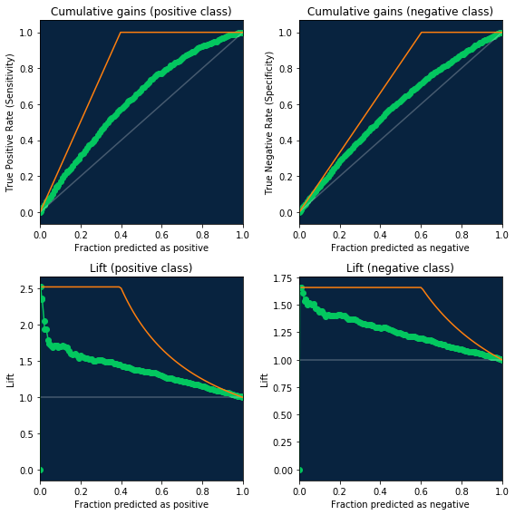
Cumulative gains and lift
ROC curve data also now contains information necessary for creating the cumulative gains and lift charts. Just use new fields fraction_predicted_as_positive and fraction_predicted_as_negative to get X axis and
- For cumulative gains use
true_positive_rate/true_negative_rateas Y axis - For lift use new fields
lift_positive/lift_negativeas Y axis.
You can check code for visualization below, along with baseline/random model (in gray) and ideal (in orange)
[46]:
fig, ((ax_gains_pos, ax_gains_neg), (ax_lift_pos, ax_lift_neg)) = plt.subplots(
    nrows=2, ncols=2, figsize=(8, 8))
total_rows = (df.true_positive_score[0] +
              df.false_negative_score[0] +
              df.true_negative_score[0] +
              df.false_positive_score[0])
fraction_of_positives = float(df.true_positive_score[0] +
                              df.false_negative_score[0]) / total_rows
fraction_of_negatives = 1 - fraction_of_positives

# Cumulative gains (positive class)
ax_gains_pos.set_facecolor(dr_dark_blue)
ax_gains_pos.scatter(df.fraction_predicted_as_positive, df.true_positive_rate,
                     color=dr_roc_green)
ax_gains_pos.plot(df.fraction_predicted_as_positive, df.true_positive_rate,
                  color=dr_roc_green)
ax_gains_pos.plot([0, 1], [0, 1], color=white, alpha=0.25)
ax_gains_pos.plot([0, fraction_of_positives, 1], [0, 1, 1], color=dr_orange)
ax_gains_pos.set_title('Cumulative gains (positive class)')
ax_gains_pos.set_xlabel('Fraction predicted as positive')
ax_gains_pos.set_xlim([0, 1])
ax_gains_pos.set_ylabel('True Positive Rate (Sensitivity)')

# Cumulative gains (negative class)
ax_gains_neg.set_facecolor(dr_dark_blue)
ax_gains_neg.scatter(df.fraction_predicted_as_negative, df.true_negative_rate,
                     color=dr_roc_green)
ax_gains_neg.plot(df.fraction_predicted_as_negative, df.true_negative_rate,
                  color=dr_roc_green)
ax_gains_neg.plot([0, 1], [0, 1], color=white, alpha=0.25)
ax_gains_neg.plot([0, fraction_of_negatives, 1], [0, 1, 1], color=dr_orange)
ax_gains_neg.set_title('Cumulative gains (negative class)')
ax_gains_neg.set_xlabel('Fraction predicted as negative')
ax_gains_neg.set_xlim([0, 1])
ax_gains_neg.set_ylabel('True Negative Rate (Specificity)')

# Lift (positive class)
ax_lift_pos.set_facecolor(dr_dark_blue)
ax_lift_pos.scatter(df.fraction_predicted_as_positive, df.lift_positive,
                    color=dr_roc_green)
ax_lift_pos.plot(df.fraction_predicted_as_positive, df.lift_positive,
                 color=dr_roc_green)
ax_lift_pos.plot([0, 1], [1, 1], color=white, alpha=0.25)
ax_lift_pos.set_title('Lift (positive class)')
ax_lift_pos.set_xlabel('Fraction predicted as positive')
ax_lift_pos.set_xlim([0, 1])
ax_lift_pos.set_ylabel('Lift')
ideal_lift_pos_x = np.arange(0.01, 1.01, 0.01)
ideal_lift_pos_y = np.minimum(1 / fraction_of_positives, 1 / ideal_lift_pos_x)
ax_lift_pos.plot(ideal_lift_pos_x, ideal_lift_pos_y, color=dr_orange)

# Lift (negative class)
ax_lift_neg.set_facecolor(dr_dark_blue)
ax_lift_neg.scatter(df.fraction_predicted_as_negative, df.lift_negative,
                    color=dr_roc_green)
ax_lift_neg.plot(df.fraction_predicted_as_negative, df.lift_negative,
                 color=dr_roc_green)
ax_lift_neg.plot([0, 1], [1, 1], color=white, alpha=0.25)
# ax_lift_neg.plot([0, fraction_of_positives, 1], [0, 1, 1], color=dr_orange)
ax_lift_neg.set_title('Lift (negative class)')
ax_lift_neg.set_xlabel('Fraction predicted as negative')
ax_lift_neg.set_xlim([0, 1])
ax_lift_neg.set_ylabel('Lift')
ideal_lift_neg_x = np.arange(0.01, 1.01, 0.01)
ideal_lift_neg_y = np.minimum(1 / fraction_of_negatives, 1 / ideal_lift_neg_x)
ax_lift_neg.plot(ideal_lift_neg_x, ideal_lift_neg_y, color=dr_orange)

# Adjust spacing for notebook
plt.tight_layout()
[ ]: